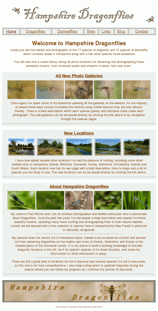
The recent work I’ve been doing adding photo galleries and location information to the website made me realise the whole site could do with a general facelift. It’s been a long and sometimes fraught task, but now it’s finally finished!
The pages all follow the same theme with grey backgrounds for text, photos and links.
The species pages now contain links to the photo gallery, suggested locations and a handy at-a-glance flight graph.
The locations pages now all open in the parent window with back and forward links at the base of the page. They also contain links to all the key species found and more importantly grid references and links to maps.
Navigation throughout the site is also much improved.
Now that’s done I can prepare for the new season, which is due to start as soon as the temperature rises!

